Advance Interactive Design - Prototyping
Adv Interactive / BDCM / The Design School
Task 2 - Prototyping
INSTRUCTIONS
Proposal
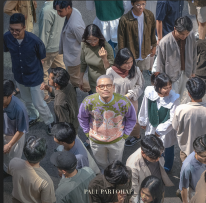
Content: Paul Partohap - Lover’s Atlas
Pop/Jazz
Album concept: Sketch and Pop but also neat
Web design: Pop using sketch/paint stroke transition
Flowchart:
Transition Sequence -> Overview and background of the album -> Artist background -> Full album list -> Previous work -> Footer
Visual: Large album cover image
Description: Brief overview and background text
2. Artist Background
Visual: Artist's portrait
Description: Biography and key achievements
3. Full Album List
Description: Biography and key achievements
3. Full Album List
Visual: Grid of album covers with titles
Description: List of all songs with preview options
4. Previous Work
Description: List of all songs with preview options
4. Previous Work
Visual: Timeline or carousel of previous albums
Description: Highlights of past albums and major hits
5. Footer: Visual: Clean and simple footer with navigation links
Description: Contact information, social media links, and legal notices
Description: Highlights of past albums and major hits
5. Footer: Visual: Clean and simple footer with navigation links
Description: Contact information, social media links, and legal notices

Fig 1.1.0
WireFrame
Referring to the color palette, I decided to only use 3 colors: light green, dark green, and light purple to avoid color clash and overload. and for the base colour, I chose black which gave a deep vibe.
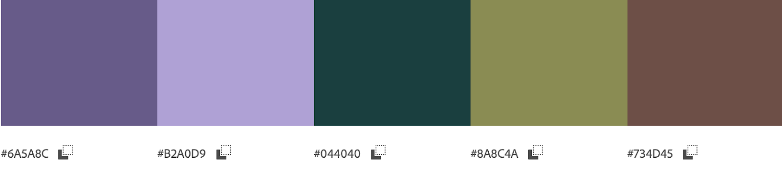
Fig 1.1.2
For the art style I use blocky and geometrical shapes and to make it more interesting I put a lot of micro animations to increase the immersiveness. this wireframe had several animations that i couldn't put on Figma and i used a line to describe where the transition would go.

Fig 1.1.3
After applying all of the colors i started to fill up the contents and tried to work on several icon placements to make it more efficient
HIFI Wireframe

Fig 1.1.3
I'd alter some of the user flow, I canceled the initial plan for the artist profile, I could put the entire info on the main page meanwhile I want to put the previous album while hovering there will be a video showcasing the song

Fig 1.1.4
I put this effect on the title screen as well so that it'll be more interactive, although I still think that i'll be overkill

Fig 1.1.5
also, I added more shading to the line so that it'll be more proper but in the outcome, I want to make it more liquified
Final Wireframe

Fig 1.1.6
Hi Fi on 2nd Page
Presentation
Presentation Video
Fig 1.1.7


Comments
Post a Comment