Application Design 2 - Task 1

Week 1 - 4
Justin Averill Prasetya / 0355048
App Design 2 / BDCM / The Design School
Task 1
INSTRUCTIONS
trade foreign exchange, cryptocurrency, metals, and
CFD cash. This app wasn’t meant to be an aesthetic app, but improving the aesthetic can have a
huge impact on usability. Also according to my
experience as an amateur trader. This app was good
but lacked good navigation and was rather confusing, also
UI UX’s job was to maintain an easy-to-use and user-friendly interface.
Problem:
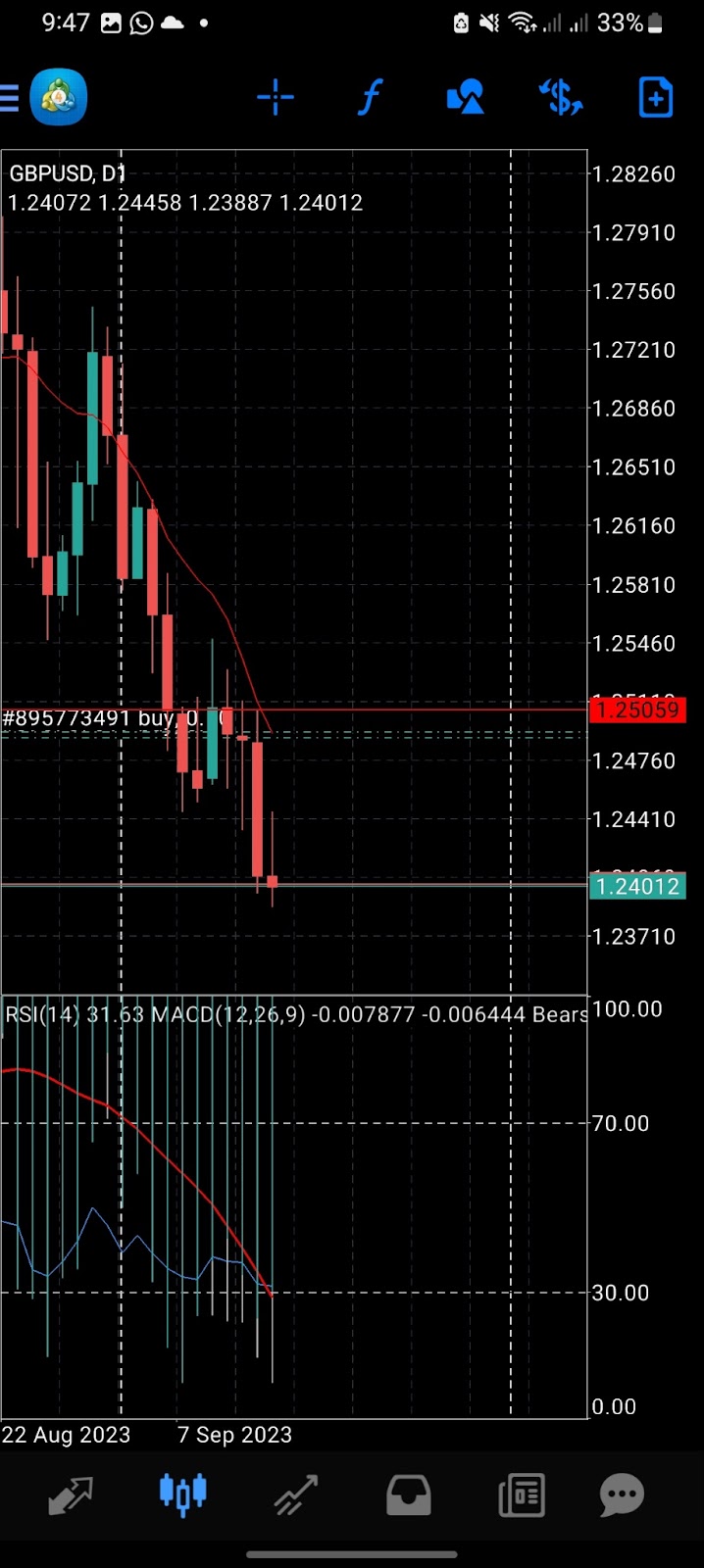
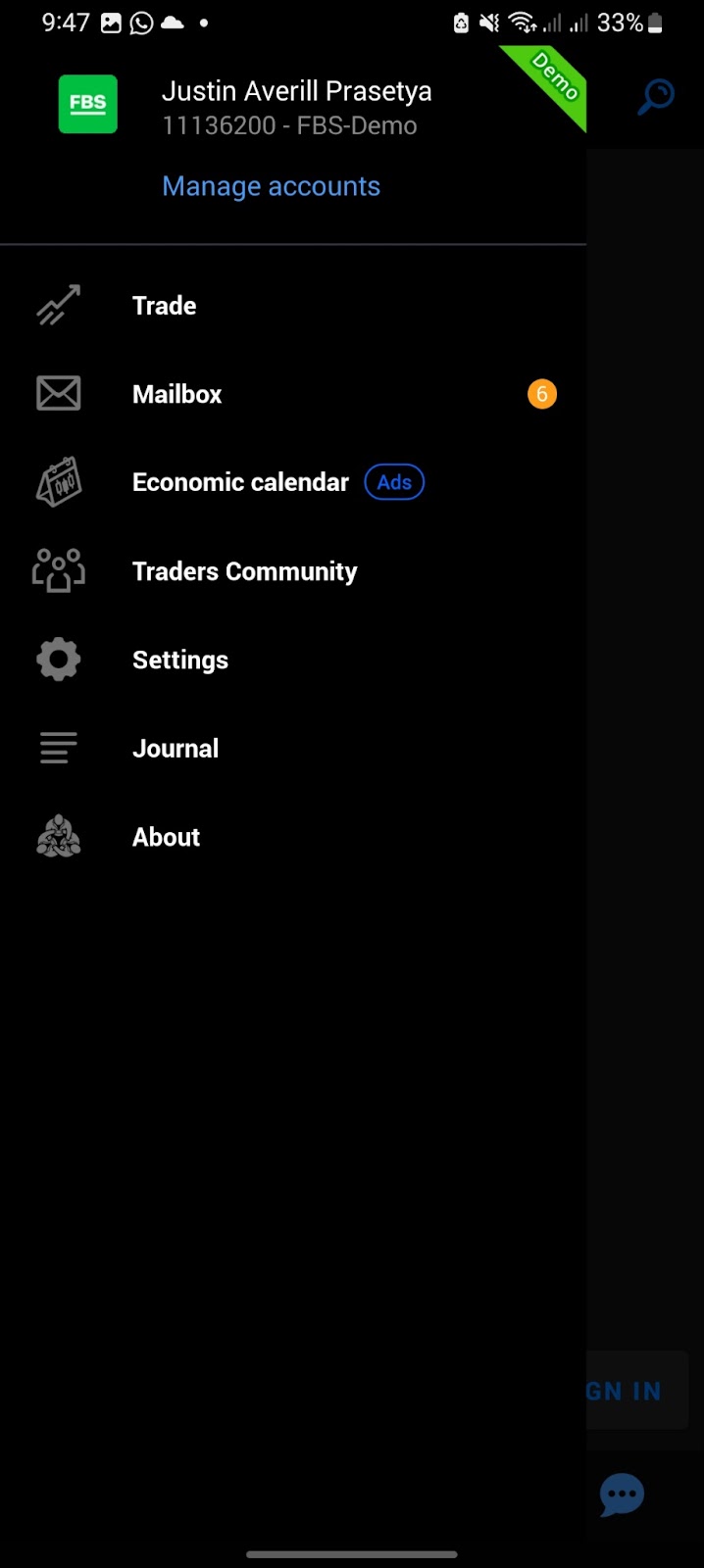
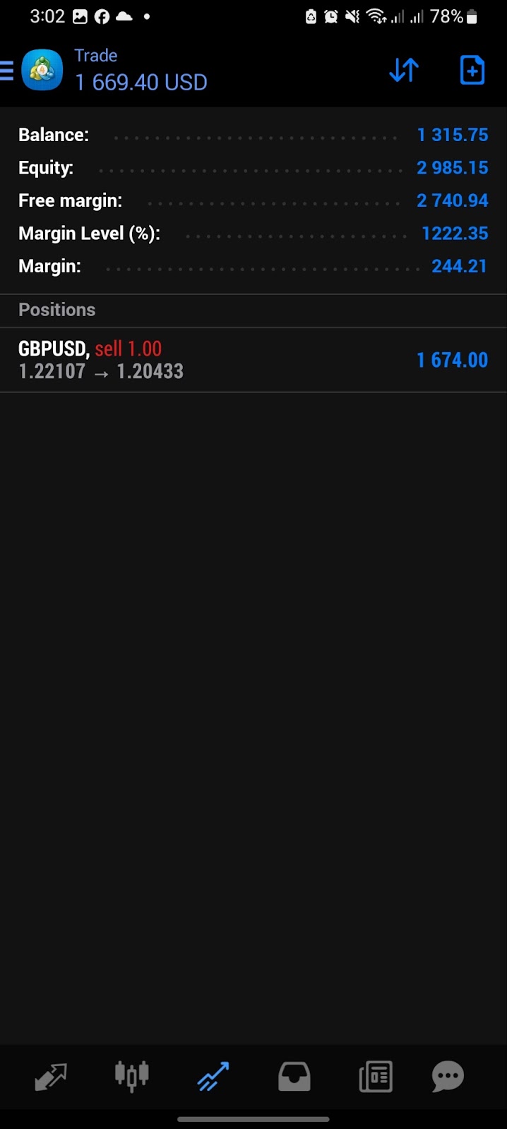
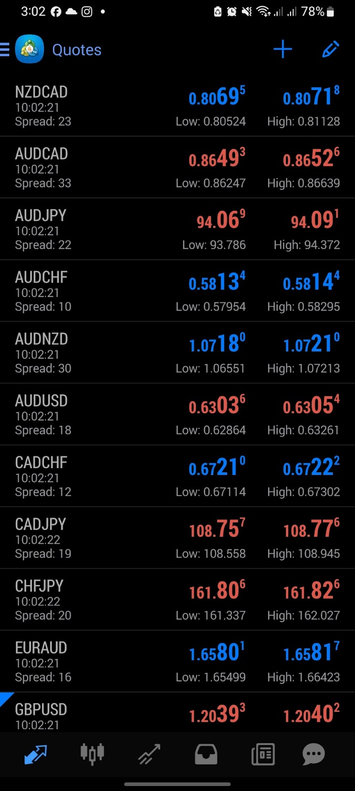
Metatrader 4 was quite an old trading app but the community and the
user keep going on right now. The problem was the UI stayed the
same and never got updated. By looking at the rating, this app was
hard to use especially when you’re new and didn’t have a tutor or
someone who showed you the app first. Also, the usage of many
icons can be confusing, especially when it regards plus and
cursor icons that look the same, I was confused at first until I
asked my uncle how to add symbols at first he was also confused
but after that, he showed me that what I’ve been pressing was a
cursor symbol, not a plus. Also, everything felt confusing and
I still had unnecessary things that didn’t even work
Previous UI:
Updated Sector:
Buy and Sell: To buy and sell the stock.
Chart: To display the movement of the forex or stock so that you can predict the next movement
and also you can see the support and resistance in it.
Information (Current deposit, Withdrawal, Margin, Equity, Current Credit, and much more): To
give exact information regarding the credit and account.
Current Watchlist: To see the exact movement of the stocks or forex at the same time and
precisely
Risk Management Features such as Stop Loss and Take Profit: To help the user control the
trade.
Changeable Lot Size: So you can get your designated lot size
History: To check the previous history.
User Settings: To have easier access when you want to change your credentials
Search Bar: So that you can search your designated symbol and currency more easily.
Notification: to keep track
Improved UI:
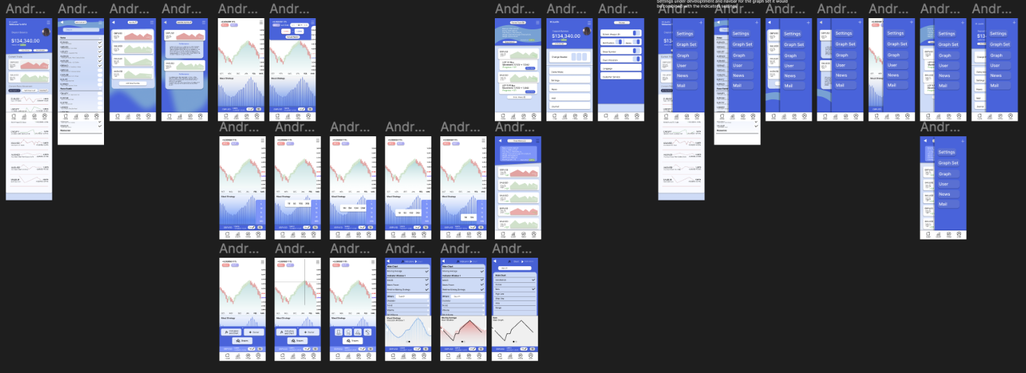
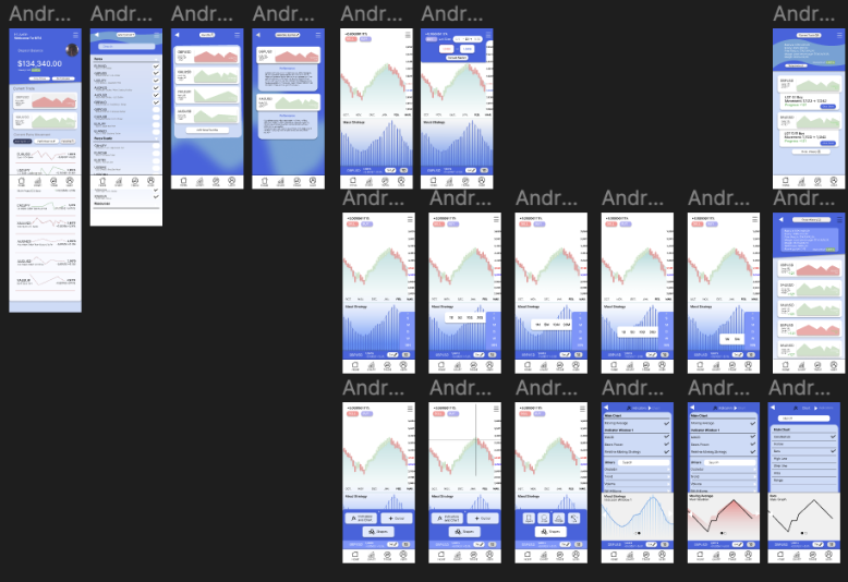
Fig 1.1.2
Feedback:
Marcellino Rafael
The app color looked so vibrant and calm at the same time. all of the expected features is there but there's one problem about what's the use of the selected symbol. Every new user must be confused. for me, it would probably be better to make it into news instead or more necessary features
Nabil Aqila Rahman
I understand the app. It provides enough information on the home screen but the downside was the lack of visual elements usage. All of the elements that are expected are there, especially the part where you can buy while seeing the chart going and also more detailed information inside.
Alham
A bit cluttered but that's fine although it was like probably because I think there's too much information on the home screen. For the entire flow, it was obvious enough, and nothing to complain about. And what's with the selected symbol? is it the same as the news
Jonathan Wiguna
OK, better than before and also more modern. The problem was is the color scheme suited the initial idea because I thought it was too vibrant meanwhile the trading app should be bold but for the rest, it was fine enough. although it may be better to pull some visual elements on the indicator and graph settings
Jeff Shahmi
The thing that's been discussed in the research was there. But it seems like there's some part that's still don't know the intention for. The main menu when you showed the current balance and what's going on was brilliant enough but for the rest, it's better la than the one shown on mt4
App Design 2:
App Design 2 is basically when we implement our app design 1 into the whole usable app, by choosing 1 MVP of the app and trying to code it using HTML.
Problem From Previous App:
Not doable because the main MVP is buying and selling stocks with all of the dynamic and updated graphics.
Alternative Options:
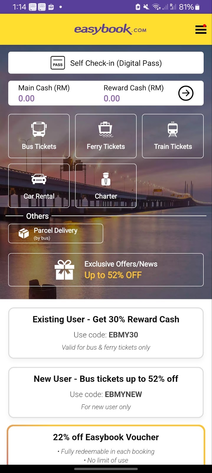
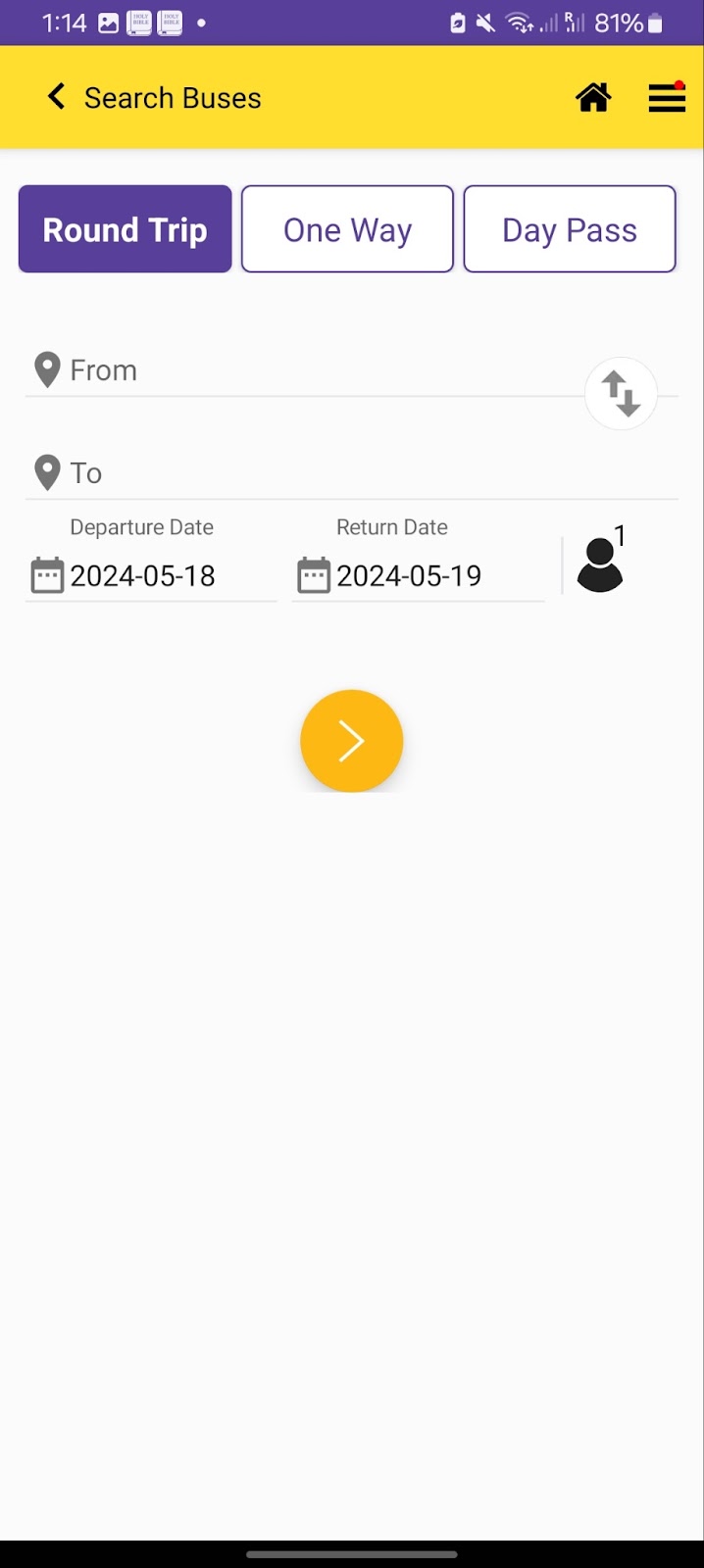
EasyBook
Flaws:
Lack of clarity in navigation
The usage of too much black-and-white space
A lot of unnecessary features
The UI seems plain
Unclear usage of icons
Home Page and Scheduling Page
Art Directions
Font: Inter
Colour:
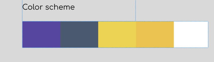
Fig 1.1.4
App Design: Blocky but got a lot of curved rectangles, and split sections using distinctive colors to indicate different features.
Final:
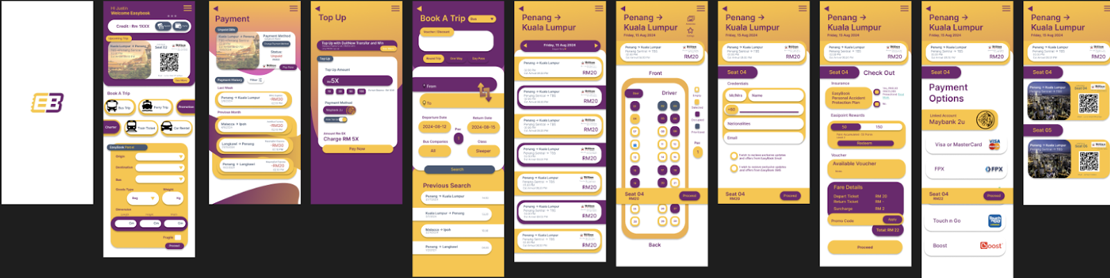
Fig 1.1.5
Coded App Feature:
We trying to focus only on the main mvp which was the bus ticket ordering method starting from the home screen -> Schedule -> Seat Picking -> Check Out -> Payment Options and The Ticket itself.
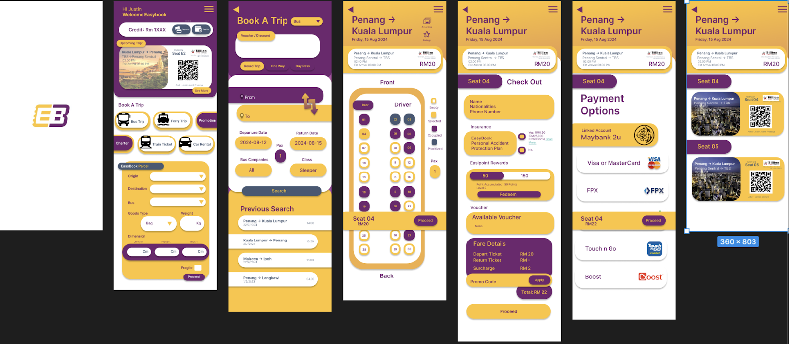
Fig 1.1.6
Figma File: https://www.figma.com/design/fkB6txL957EPMOaLRX9eFW/UI-Application-Design-2-(Copy)-(Copy)?node-id=2410%3A2&t=DvuypkVMRXktRUxq-1 On Page 3
Presentation Video:

Comments
Post a Comment