App Design Final Project
Justin Averill Prasetya / 0355048
GCD 60904 / BDCM / The Design School
Project Lo FI
INSTRUCTIONS
<iframe src="https://drive.google.com/file/d/1DJdzcl5x38RHooL6_-MHGkEN2_EzIRsS/preview" width="640" height="480" allow="autoplay"></iframe>
Lo-Fi Final:
Initial Concept and Design Ideation
for the font for Lofi, i use Inter for the clear navigation and boldness but for the actual app I was considering using Comfortaa for the more aesthetic and I tried it is suitable enough. For the color scheme, the color that I considered using was the mild-themed color.
For the concept art, it would probably look like this for the finals
Fig 1.1.2
Fig 1.1.3
Fig 1.1.4
The more colorful approach was implemented in the final outcome but for the current lo-fi project, it would be necessary to come up with clearer navigation and features first. The final outcome was this. I compacted the navbar put the most necessary features and highlighted more obvious and easily navigated
Fig 1.2.1
Hamburger Bar Fig 1.2.2
User Testing:
Ray:
Quite easy to understand but preferable to consider putting the graph setting on the set on graph menu so that it would be centered
Chino:
I like the design but personally, I think that the settings on user can contain more feature
Andre: it was clear and easily distinguishable but there are certain feature that haven't exposed
Final App Design:
Fig 1.2.3
By finalizing this I can continue refining the navigation and use a more engaging color with bright blue. Considering to still using the inter font and scrapping the initial concept of comfortaa because it's too unsuitable.
Fig 1.2.4
The concept was to make it as sleek and chill as possible and also give comfort to the eyes while looking at the app for a long time. After this I will convert all of the remaining pages to color and improve the placement and visual elementsFig 1.2.5
I put more detailed features according to the minimum viable product and the information architecture. Firstly a designated page for favorite pairs and stock and the detailed performance. And also the more sleek interface and centralized feature is utilized
Fig 1.2.6
The design that I used has a centralized feature and is also more easier and recognizable navigation flows. The easier access when finding designated oscillators is utilized as well
Fig 1.2.7
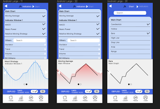
I combined the graph settings as well
For the next one was to get the navigation going and set aside the less used feature and also according to the mvp i need to make the graph visible when buying so i came up with the buying page on the graph page
Fig 1.2.8
Fig 1.2.9
Detailed information about withdrawal and a designated page for more informative sections.
Lastly, for the user sections, it contains the fewer usage elements but it need to be maintained because it has quite a lot of necessary stuff
Fig 1.2.10
Hamburger bar
1.2.11
Overview
Fig 1.3.1
Navigation Flow Overview
The right ride is meant for the navbar so i can differentiate the flow
Link: Figma Link
Usability Testing:
I need to make the flow more clearer so that the user can perceive more easier
Marcellino Rafael
The app color looked so vibrant and calm at the same time. all of the expected feature is there but there's one problem about what's the use of the selected symbol. Every new user must be confused. for me, it would probably be better to make it into news instead or more necessary features
Nabil Aqila Rahman
I understand the app. it provides enough information on the home screen but the downside was the lack of visual elements usage. All of the elements that are expected are there, especially the part where you can buy while seeing the chart going and also more detailed information inside.
Alham
A bit cluttered but that's fine although it was like probably because I think there's too much information on the home screen. For the entire flow, it was obvious enough, and nothing to complain about. And what's with the selected symbol? is it the same as the news
Jonathan Wiguna
Ok, better than before and also more modern. The problem was is the color scheme suited the initial idea because i thought it was too vibrant meanwhile the trading app should be bold but for the rest, it was fine enough. although it may be better to pull some visual elements on the indicator and graph settings
Jeff Shahmi
The thing that's been discussed in the research was there. But it seems like there's some part that's still don't know the intention for. The main menu when you showed the current balance and what's going on was brilliant enough but for the rest it's better la than the one show on mt4


Comments
Post a Comment