Advance Typography Exercise

Justin Averill Prasetya / 0355048
/ BDCM / The Design School
LECTURES:
- Radial
- Dilational
- Random
- Grid
- Modular
- Transitional
- Bilateral


This system is based on the exploration of an existing structure or numerous structures combined. An extraction of crucial lines both curved and straight are formed. The designer then organizes his information around this super-structure, which includes non-objective elements to create a unique and exciting mixture of texture and visual stimuli.
It is an interesting manner of exploration and provides context to the forms developed in the designs context why? Due to the fact that the system/structures were developed around key features of an environment associated to the communicators of the message.

This system is based on the exploration of an existing Grid Systems. I developed this system to get students to explore; the multitude of options the grid offer; to dispel the seriousness surrounding the application of the grid system; and to see the turning of pages in a book as a slowed-down animation in the form that constitutes the placement of image, text and color.
The placement of a form (irrespective of what it is) on a page, over many pages creates movement. Whether the page is paper or screen is irrelevant.

Handwriting
Why is handwriting important in the study of type/typography?
We study handwriting because the first mechanically produced letterforms were designed to directly imitate handwriting. Handwriting would become the basis or standard for form, spacing and conventions mechanical type would try and mimic.
The shape and line of hand drawn letterforms are influenced by the tools and materials used to make them. Sharpened bones, charcoal sticks, plant stems, brushes, feather and steel pens all contributed to the unique characteristics of the letterform.


The Egyptian writing system is fused with the art of relief carving. The system was a mixture of both rebus and phonetic characters the first link to a future alphabetic system. Hieroglyphic images have the potential to be used in three different ways:
- As ideograms, to represent the things they actually depict
- As determinatives to show that the signs preceding are meant as phonograms and to indicate the general idea of the word.
- As phonograms to represent sounds that "spell out" individual words


In England the uncial evolved into a more slanted and condensed form. While English and Irish uncials evolved, writing on the European continent devolved considerably and needed a reformer. Luckily it came in the Carolingian Handwriting Reform.

A court school was established under the direction of Alcuin of York. During Charlemagne's patronage book production increased and language was standardized - pronunciation and spelling as well as writing conventions- capitals at the start of a sentence, spaces between words and punctuation.
A new script. emerged, the Carolingian minuscule.

What is Gothic? Gothic was the culminating artistic expression of the middle ages, occurring roughly from 1200-1500. The term Gothic originated with the Italians who used it to refer to rude or barbaric cultures north of the Italian Alps.
the vertical supplanted
horizontals as the dominant line in architecture; the pointed arch replaced the round arch of the Romans; the almond shape, or mandorla, was preferred. Gothic writing forms reflected this aesthetic. Blackletter is characterized by tight spacing and condensed lettering. Evenly spaced verticals dominated the letterform.
Condensing line spacing and
jested through letter spacing reduced the d striving:
amount of costly materials in book production.
The Italian Renaissance
As the Gothic spirit reached its apex in the other areas of western Europe, Humanist scholars in Italy were slowly reviving the culture of antiquity.
The renaissance embrace of ancient Greek and Roman culture spurred a creative wave through Italian art, architecture, literature and letter form design.
The Humanist admired the
Carolingian script, which had clear open handwriting.
Humanist named the newly rediscovered letterforms Antica.
The renaissance analysis of form that was being applied to art and architecture was directed toward letterform • resulting in a more perfect or rationalized letter.

Printing (wood block) had already been practiced in China, Korea and Japan
(Dharani Sutra, AD 750). Earliest known printed book (AD innovation was pioneered in 868) is the Diamond Sutra: 16* scroll with the world's first
printed illustration.
In late 14 C. several decades before the earliest printing in
Europe, the Koreans establish a foundry to cast movable type in bronze allowed the dismantling and resetting of text. With the creation of their new script Han'gul, the Koreans would succeed where the Chinese failed.
Why do we talk about Greek influence on Rome, but not Egyptian or
Near Eastern influence on Greece?
Because in the 19th century and the rise of the modern British Empire, it became out of style to credit Africa or Africans with anything of value, and therefore Greece and Rome were elevated over much older, much more influential civilizations, specifically Ancient Egypt, but also less extensive or old civilizations like Mesopotamia, the Indus Valley, China, etc.

Why is handwriting important in the study of type/typography?
We study handwriting because the first mechanically produced letterforms were designed to directly imitate handwriting.
Handwriting would become the basis or standard that for form, spacing and conventions mechanical type would try and mimic.
For decades, Asia/East has neglected much of its written heritage, and by adapting western printing technologies (letter press, linotype, Unicode), it was difficult to create many of the old text in printed form, because it would take know-how, much time, effort and money.
However with a mild renaissance in the East, with the advent of computer programmers in large numbers, we are starting to see the proliferation of indigenous scripts on phones, tablets and computers.
Designing Type
So why design another typeface? Xavier Dupré (2007) in the introduction of his typeface Malaga suggested two reasons for designing a typeface:
- type design carries a social responsibility so one must continue to improve its legibility.
- type design is a form of artistic expression.

"Adrian Frutiger is a renowned twentieth century Swiss graphic designer. His forte was typeface designing and he is considered responsible for the advancement of typography into digital typography. His valued contribution to typography includes the typefaces; Univers and Frutiger.
Let us look at the typeface Frutiger, his name sake. Frutiger is a sans serif typeface designed by the Swiss type designer Adrian Frutiger in 1968 specifically for the newly built Charles de Gaulle International Airport in France. A more detailed history can be found here. Purpose: "The goal of this new typeface was create a clean, distinctive and legible typeface that is easy to see from both close up and far away. Extremely functional."
General Process Of Type Design
- Research
- Sketching
- Digitization
- Testing
- Deploy
Research
When creating type, we should understand type history, type anatomy and type conventions. We should also know terminologies, side-bearing, metrics, hinting
It is then important to determine the type's purpose or what it would be used for, what different applications it will be used in such as whether the typeface is for school busses or airport signages, etc.
Sketching
Some designers sketch their typeface using the traditional tool set (brushes/ pens, ink and paper) then scan them for the purpose of digitization. They are more confident with their hands and have better control using it.
Digitization
There are professional software that are used in the digitization of typefaces, amongst the leading software are: FontLab and Glyphs App.
There are designers that also use Adobe Illustrator to design or craft the letterforms and then introduce it into the specialized font apps.
This however is frowned upon by the purist.
Testing
Testing is an important component in the design thinking process.
The results of the testing is part of the process of refining and correcting aspects of the typeface. Prototyping is also part of the testing process and leads to important feedback.
Deploy
Even after deploying a completed typeface there are always teething problems that did not come to the fore during the prototyping and testing phases. Thus, the task of revision doesn't end upon deployment.

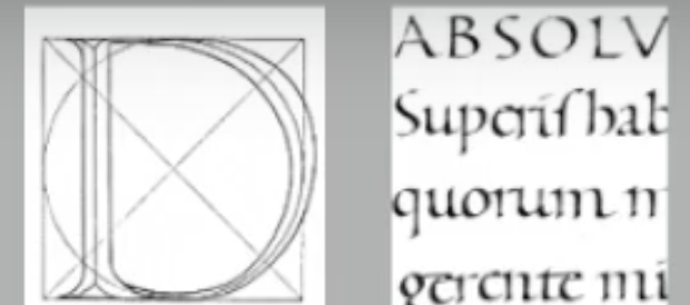
Roman Capital: The grid consists of a square, and inside it a circle that just touches the lines of the square in four places. Within the square, there is also a rectangle. This rectangle is three quarters the size of the square and is positioned in the centre of the square. More here and here.

Depending on their form and construction, the 26 characters of the alphabet can be arranged into groups, whereby a distinction is made between a group for the capitals and a group for lowercase letters.
Many different forms and constructions must be taken into account when designing a new type. An important visual correction is the extrusion of curved (and protruding) forms past the baseline and cap line. This also applies to vertical alignment between curved and straight forms
A visual correction is also needed for the distance between letters. It is not possible to simply place letters next to each other with equal spacing between them. The letters must be altered to a uniform
'visual white space. This means that the white space between the letters should appear the same. This is called 'fitting' the type.
Perception And Organization
Perception is "the way in which something is regarded, understood, or interpreted". So, is perception what you see and therefore understand--or what you are manipulated into seeing and understanding?
Contrast: Carl Dair on the other hand adds a two more principles into the mix; texture and direction "to make design work and meaning pop out - clearly and unambiguously, and with flair." via the use of contrast in typography.
Dair posits 7 kinds of contrast (most of which has already been covered by Rudi Reugg albeit using different terms): 1. Size, 2. weight, 3. contrast of form, 4. contrast of structure, 5. contrast of texture, 6. contrast of colour and 7. contrast of direction.

A contrast of size provides a point to which the reader's attention is drawn. For example if you have a big letter and a small letter you will obviously see the big letter first before the small.

Weight describes how bold type can stand out in the middle of lighter type of the same style. Other than then using bold, using rules, spot, squares is also provide a "heavy area" for a powerful point of visual attraction or emphasis, therefore not only types of varying weight.

Contrast of form is the distinction between a capital letter and its lowercase equivalent, or a roman letter and its italic variant, condensed and expanded versions of typeface are also included under the contrast of form.

Structure means the different letterforms of different kinds of typefaces. For example, a monoline sans serif and a traditional serif, or an italic and a blackletter.

By putting together the contrasts of size, weight, form, and structure, and applying them to a block of text on a page, you come to the contrast of texture. Texture refers to the way the lines of type look as a whole up close and from a distance.

Contrast of direction is the opposition between vertical and horizontal, and the angles in between. Turning one word on its side can have a dramatic effect on a layout. Text blocks also have their vertical or horizontal aspects of direction. Mixing wide blocks of long lines with tall columns of short line can also create a contrast.

The use of color is suggested that a second color is often less emphatic in values than plain black on white. Therefore it is important to give thought to which element needs to be emphasized and to pay attention to the tonal values of the colors that are used.
INSTRUCTIONS
Week 1 - Week Exercises:
Typographic Systems
Typographic systems: Axial, Radial, Dilatational, Random, Grid, Modular, Transitional and Bilateral
“An understanding of systems of
the visual organization gives the designer in-depth knowledge
of the design process. The traditional ties that bind design
education and the visual process to the rigid horizontal and
vertical grid systems of letterpress are no longer the sole means
of order. It is possible for the designer to use a more fluid means
to create typographic messages through the eight systems of
typographic organization. These systems expand the visual
language of typographic communication and invite the reader
into the text.” (Elam, 2007)
I used Futura Std font but i mixed the font so there's a book,heavy,bold, and extra bold font in there. For the size is 200mm x 200mm
Axial:


Dilatation:


FEEDBACK
Week 1 Specific: My design could work and i need to figure out more about the others
Week 3 Specific : i did a bad job with my extraction and the fond ended up didn't have the feeling that represent the object but all i need was fixing my typeface and analyse more the object
REFLECTIONS
FURTHER READING


Comments
Post a Comment