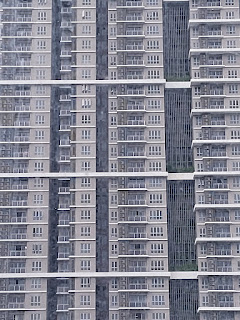
For the first week to the fourth week we're learning about design principle with ms Yip Jinchi. And for the exercise we need to choose 5 of 9 design principle and make 1 design per design principle
9 Design Principle
1) Contrast: Contrast is a design principle that resemble opposite elements to avoid monotonous design output. Contrast has many aspect from colour, shape, and textures. For example, light and dark colors, smooth and rough textures, large and small shapes. Contrast can be used to create variety, visual interest,
Fig. 1.1.1
Fig. 1.1.2
2) Gestalt: Gestalt principle is a human perspective that makes a complicate object more simplified that describe how humans group similar elements, recognize patterns and simplify complex images when we perceive objects.
Fig.1.2.1
Fig.1.2.2
3) Balance: Balance Principle is resembling a balance between the distribution of visual weight and there are 2 balance
symmetrical Symmetrical balance occurs when you have two identical sides of a design with a central point of axis -- so if you cut the design in half, the left and right are mirror images of each other.
Fig.1.3.1
Fig 1.3.2
Asymmetrical: Asymmetrical balance occurs when you have different visual images on either side of a design, and yet the image still seems balanced.
Fig 1.4.1
Fig 1.4.2
Fig 1.4.3
4)Emphasis: Emphasis principle used to make a design more stand out in 1 point and creating more dominance. Emphasis can be a shape, colour, or value. Movement is the path the viewer's eye takes through the work of art, often to focal areas.
Fig 1.5.1
Fig 1.5.2
5) Repetition: Repetition principle is to make rhythm on the design output and and also make it seem active and not monotone. pattern that increase the visual excitement by enriching surface interest
this pic i took by myself
Fig.1.6.1
Fig 1.6.2
6) Movement : Movement principle is a principle that make the objects seem to be moving. Movement comes from shape ,form ,line ,curve,
Fig 1.7.1
Fig 1.7.2
7) Harmony and Unity : Unity and harmony in art are used by artists to tie a composition together and help the composition make sense as a whole piece of art. Harmony is all your elements preference in your design
Fig 1.8.1
Fig 1.8.2
8) Symbol: Symbol is a graphical elements that can represent
something that contains a shape or object
Pictorial symbol: simplified picture
Abstract Symbol: looks like the object they represent but with less details.
Arbitrary Symbol: Arbitrary symbols have no resemblance with the object they
represent
9) Word and Image: Picture can make the user or viewer more relate to the design
and typography is to create a message
Fig 1.9.1
Fig 1.9.2
____________________________________________________________
INSTRUCTIONS https://drive.google.com/file/d/1gp6DMsKYIKPH5aOOgoftpj9YfcxOkCsb/view?usp=sharing
____________________________________________________________
Exercise 1
Task 1:So for the first week to the fourth week our task is to make 5 out of 9 Design Principle
- Gestalt
- Contrast
- Emphasis
- Balance
- Repetition
- Movement
- Harmony and unity
- Symbol
- Word and image
The design I've chosen are : Word and Image, Contrast, Emphasis, Balance,and Movement
1) word and Image:
Fig 2.1.1
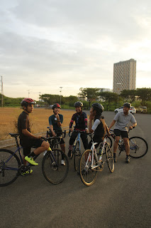
- Idea of exploration : So I captured this photo at dawn so I get a sunset feeling for his photo and I gradient it so the orange be more brighter
Fig 2.1.2
And then I added the text
Fig 2.1.2
The changes from last week are
The sunset word is more up and the word transera waterpark is a bit closer to each other
Fig 2.1.3
Short Rationale: For this one the photo itself representing a group of cyclist chatting and waiting for the sunsets so I captured it and made the text that represent the photo
4) Contrast : Contrast is a design principle that resemble opposite elements to avoid monotonous design output. Contrast has many aspect from colour, shape, and textures. For example, light and dark colors, smooth and rough textures, large and small shapes. Contrast can be used to create variety, visual interest,
https://www.uxpin.com/studio/blog/design-with-contrast/
Fig 2.2.1
https://zizzogroup.com/blog/7-principles-of-design/
Fig 2.2.2
My Artwork: So for this design principle I'd like to make 2 elements blending / Crashed to each other like fire and ice- Sketch / Idea of Exploration
Fig 2.2.3
Ms Yip Jinchi asked me to make another side same
as the right side and just change the colour
Before Changes
Fig 2.2.4
- After Changes / Final Design
Fig 2.2.5
Short Rationale: So my design is based on 2 types of fire the red one and the blue, Usually the blue fire is the hottest but on this one I made the red flame is more dominant because red is the one representing hotter color
3) emphasis : Emphasis is the part of the design that catches the viewer's attention. Usually the artist will make one area stand out by contrasting it with other areas. The area could be different in size, color, texture, shape, etc. Movement is the path the viewer's eye takes through the work of art, often to focal areas.
https://theschedio.com/basic-principles-of-design/
Fig 2.3.1
https://www.pinterest.com/pin/728386939713144265/
Fig 2.3.2
- My artwork : So my artwork character has a flaming leg and because he has flaming leg I think it can be included in emphasis design.
- Sketch:
Fig 2.3.4
Fig 2.3.5
Fig 2.3.6
Fig 2.3.7
Short Rationale: So he has a flame leg and he's ready to kick by lifting his leg in the dark so the flaming leg is stand out more than anything else
Balance: Balance Principle is resembling a balance between the distribution of visual weight and there are 2 balance 1) symmetrical : Symmetrical balance occurs when you have two identical sides of a design with a central point of axis -- so if you cut the design in half, the left and right are mirror images of each other.
https://www.pinterest.com/pin/142356038199781444/
Fig 2.4.1
https://www.pinterest.com/pin/142356038199781416/
Fig 2.4.2
My artwork: so the concept of this art the character name is shoto todoroki so I thought make the vector of this face and rearrange it so it make the letter S
First thing to do is make a sketch of your idea and then digitalise it
Fig 2.4.4
- First outcome and second outcome
Fig 2.4.5
Fig 2.4.6
Fig 2.4.7
- Short rationale: For this design I made 2 same face facing each other that representing the balance of the power he got an for the background is red because it represents his fire power.
Movement: Movement principle is a principle that make the objects seem to be moving. Movement comes from shape ,form ,line ,curve,
https://quiltable.com/shop/free-motion-background-mixer-wind-pah/
Fig 2.5.1
https://favpng.com/png_view/gliding-wings-drawing-color-line-art-dragon-png/dBEkcksH
Fig 2.5.2
- Sketch / Idea of exploration : So what I expected is a dragon flying and the background is just a wind current
Fig 2.5.3
Fig 2.5.4
Fig 2.5.5
Short Rationale: for this design principle I combined 2 object is a flying dragon and a wind current in his background this is representing that the dragon is flying forward with the wind current and th e wind current is partially become red because it was an effect from the dragon that can change his environment to fire
FEEDBACK
Week 2
For the contrast work I just need to reflect the fire section to the others and change the color
for the word and image the sunset word is need to be more up and the word transera waterpark is a bit closer to each other
Week 3
The sunset is need to be more up and for the emphasis I should make the background gradient and for the balance I should try make it round and the sketch of them
Week 4
For the contrast one try to use a darker colour and make it a bit more contrast and finalise the movement one
FURTHER READING

Fig 3.1.1
Author: Don Norman
A practical take on design, "The Design of Everyday Things" explores the relationship between cognitive psychology considerations and strong product design. Norman describes common product design issues that lead to customer dissatisfaction, like hidden controls or unintuitive functions.
REFLECTIONS
Experience : To be honest I have no experience in terms of design principle, but because of this course I can get the inspiration and idea more quickly also I can make my work more proper and this exercise made me to do a sketch which is I find out a little bit hard for me because I've no experience in terms of drawing at all, but I still proceeded to finish my work on time although not as good as other but I will try my best in the next task. 👍


Comments
Post a Comment